
We will use this page to post information you may find useful as the COVID-19 pandemic spreads across Pennsylvania.
Information for Pennsylvania
Number of New Cases Each Day
http://www.example.comThe first graph shows the number of new PA COVID-19 cases each day since March 4.
The second image is a slide show that allows you to compare the number of new cases over seven day periods starting April 1. Looking at a graph over seven day intervals will give us a better idea of growth in new cases because we can draw a straight line to represent the average over that time. The red line is the number of cases reported each day. The black line represents an average of the red line. The black line makes it easier to do day to day comparisons.
We want to see the black line going down hill. Once there is a consistent pattern, we can make a projection of when the number of daily new cases will reach zero. However, the projection will only be an estimate as the steepness of the line will change over time.
Click the arrows to move back and forth between the graphs and to watch the black line change. We want to see it change from going uphill to going downhill.
Tracking Progress in Slowing the Growth of COVID-19
This graph compares the the growth of COVID-19 in Pennsylvania (red line) to reference lines that show the graphs for different doubling times. At the beginning epidemics grow at an exponential rate. This means that cases double at a fixed rate. The doubling time for the reference line is 2.33 days. At the beginning PA cases were doubling at about the same rate as the reference line. The dotted line shows a line with a doubling time of 3 days. More recently the PA curve is parallel to that curve, but there is still a doubling time.
If we are effective in our measures to slow the growth of the virus we will see the red line become more flat and farther from the dashed lines over time. When the red line becomes horizontal, the number of new cases will have stopped.
Keep in mind that the graph is based on the number of cases reported to the PA Department of Health and is dependent on the availability of tests. As the rate of testing increases, the number of reported cases will also increase.
The reference lines are created using the exponentional functions for a 3 and 4 day doubling time.
The actual cases are pretty far from the 3 day doubling reference lineand approaching intersction with the second reference line that shows how the virus would behave if the number of cases were doubling every four days.
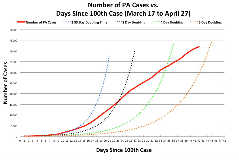
The data for this graph comes from the PA Department of Health Coronavirus web site, https://www.health.pa.gov/topics/disease/coronavirus/Pages/Coronavirus.aspx
Projecting PA Progress at Holding Down the Death Rate The Institute for Health Metrics and Evaluation (IHME) at the University of Washington projects the peak for the rate of increase in COVID-19 deaths for the United States and for individual states. https://covid19.healthdata.org/projections. Their original model projected Pennsylvania will hit its peak on April 17.
The model was updated on April 7. The red lines are the maximum daily deaths projected by the models, the green lines are the projected minimums, and the projected means are represented by the black lines. The original model lines are now represented in the same color but by smaller dots to make them less prominent. The new model lines are in the same color but thicker than the modeled values in the previous graphs. Actual PA daily deaths are represented by the solid red line.
IHME projects PA will have sufficient hospital beds to meet our needs.
Timeframe for graph is March 17 to April 30

Animation Showing How the Virus Has Spread Across Pennsylvania
Mapping the Progression of COVID-19 Across Pennsylvania
Updated April 14, 2020
